Motion graphics can make a Facebook or Instagram ad easier to understand. They can reveal a problem, show a product step, give structure to supplied footage, and keep the message readable when audio is unavailable. What they cannot do is rescue a weak offer or guarantee that an ad will convert.
That distinction matters. Motion is useful when it carries meaning. When it is added only to make a frame feel busier, it competes with the message it was meant to support.
This guide focuses on practical production decisions: what to animate, how to plan placement-ready versions, where genuine variants differ, and what your team should supply before animation begins.
What motion graphics solve inside a Meta ad
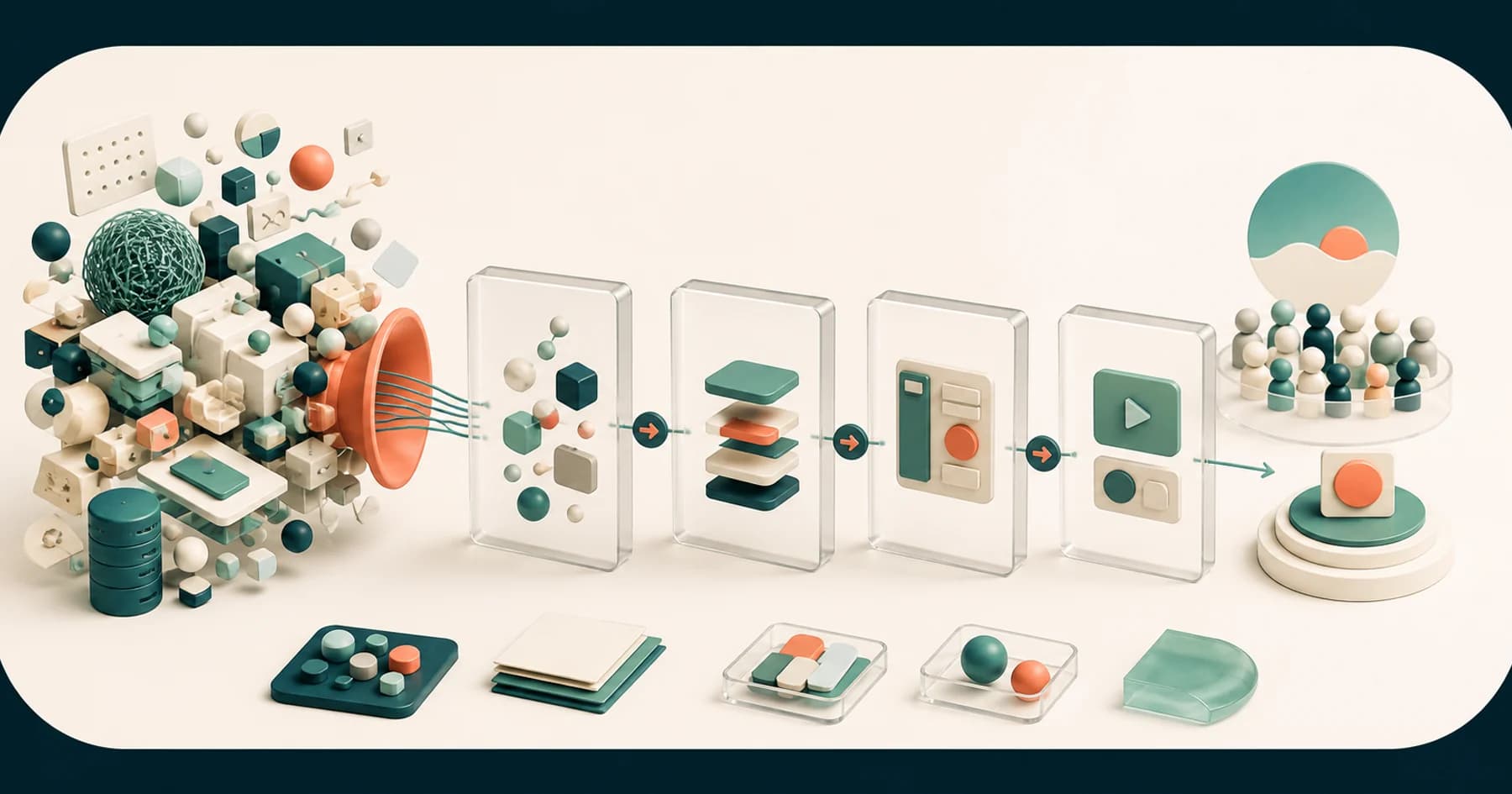
Paid-social teams often begin with an imperfect asset library: product photographs, a few UGC clips, installation footage, screenshots, a logo, and a script containing points the footage does not show. Motion graphics connect those materials without pretending a new shoot happened.
They are especially useful for:
- Making the opening problem visible before introducing the product.
- Turning an approved benefit or objection into readable on-screen language.
- Showing a sequence, comparison, interface, diagram, or process that live footage cannot explain alone.
- Giving separate clips one consistent visual system.
- Building branded transitions, end cards, and calls to action that can be reused across variants.
- Re-composing the same idea for different placement shapes rather than merely cropping a finished master.
Motion is not automatically better than static or live-action creative. The right format depends on the offer, audience, available material, and campaign. The job is to make the message legible in the environment where it appears.
Five things worth animating
1. The opening problem or change
The first frame should give the viewer one thing to understand. That might be a clogged gutter, a product before-and-after, a number building into view, a screen recording beginning at the relevant action, or a headline that names the situation.
Meta's current video guidance recommends bringing the key message or branding into the opening seconds. That does not mean every ad needs frantic cutting. It means the idea should not be hidden behind a long logo reveal or an introduction that only makes sense later.
2. The part the footage cannot show
If a presenter names software tools, a title and product screen can show which tool is being discussed. If an installer explains what happens inside a gutter system, a simple diagram can show the hidden mechanism. If a service has no physical product, typography and visual hierarchy can give shape to an otherwise abstract claim.
This is where motion graphics earn their place: not as decoration over footage, but as the missing visual evidence for a script beat.
3. Approved proof and qualifications
Animate only proof the advertiser has approved and can substantiate. That may be a demonstrated feature, a documented warranty, a customer quotation cleared for use, or a campaign offer supplied by the client.
Keep qualifications and disclaimers legible. If a claim needs several lines of tiny copy to become accurate, the answer is usually to simplify the claim or give it more screen time—not to shrink the text until nobody can read it.
4. One message at a time
Kinetic type works best when the viewer knows where to look. Establish a clear order: opening idea, benefit or explanation, then action. When several headlines, icons, products, and badges move at once, the animation creates visual noise rather than emphasis.
Meta's current creative guidance also recommends controlled image text and concise copy. Treat that as a design constraint: animate the words the viewer needs, not every sentence in the script.
5. The transition into action
The call to action should feel like the conclusion of the idea rather than a generic card attached to the end. Keep the product, offer, or next step visible long enough to read. If a local installer and national product both appear, decide which brand carries credibility and which one receives the response.
That hierarchy was central to the Gutter Cap video-ad project: the product story sat through the middle of the ad, while the local installer owned the resolution and call to action.
Design separate compositions for Feed, Stories, and Reels
Meta currently recommends 4:5 for Feed and 9:16 for Stories and Reels in its placement-oriented creative guidance. These are best-practice working ratios, not the only formats the platform accepts.
The production lesson is more important than the numbers: a vertical ad and a feed ad are different compositions.
- Reposition the focal point instead of relying on an automatic centre crop.
- Rewrap and resize type for the available width.
- Keep essential words, logos, products, and faces away from interface overlays.
- Check each placement in the platform's preview or safe-zone tools before launch.
- Decide whether a shot that works wide needs a punch-in, split layout, replacement frame, or a different clip vertically.
For Instagram Stories, Meta publishes placement-specific space guidance around interface elements. Do not treat one set of safe-zone measurements as universal across every placement; use the current checker for the destination where the ad will actually run.
Make the core message work with or without sound
Meta notes that video may autoplay muted across its technologies, while Reels can default to sound-on depending on the viewer's settings. The safe production approach is to make the core story understandable without audio, then use voice, music, and sound design to improve the sound-on experience.
That can mean:
- On-screen language for the essential claim or step.
- Captions where spoken words carry the message.
- A visual demonstration that does not require narration to make sense.
- Sound design timed to motion without making sound the only source of meaning.
Facebook supports automatic, uploaded, and manually added captions in supported video workflows. Caption availability and behaviour vary by placement, so confirm the actual delivery method rather than assuming one caption setup covers every destination.
Build variants around a question, not a colour change
A useful creative variant changes something the campaign team can learn from:
- A different opening problem.
- A different hook or first proof point.
- Product demonstration versus customer explanation.
- A direct offer versus an educational opening.
- Typography-led motion versus footage-led motion.
- A different order of the same approved points.
Resizing one ad into another aspect ratio is necessary delivery work, but it is not a new creative idea. Changing a background colour while keeping the same hook, sequence, and message rarely creates a meaningful comparison either.
For the Gutter Cap project, Versmos produced two ads as a genuine pair. They differed in opening, pacing, and emphasis while sharing the same product-and-installer hierarchy. The case study also reports the campaign results with an important boundary: creative was one input alongside targeting, budget, landing page, and offer. The numbers belong to the campaign; they are not proof that animation alone caused the outcome.
That is the right way to think about motion creative. Build clear variations, launch them inside a sound media plan, and let measured testing—not a generic benchmark—show what the audience responds to.
A practical motion-ad workflow
1. Confirm the brief and placements
Settle the audience, message, approved proof, CTA, placements, ratios, and intended variants. Use our creative brief for video template if those decisions are not documented yet.
2. Audit the asset library
Map every line or beat to available footage, product images, UGC, screen content, or brand assets. Mark the moments where motion needs to explain something the source material cannot show.
3. Approve static frames before animation
Review the hierarchy, type, product scale, colours, and CTA in still frames. It is faster to correct a composition before timing, easing, sound, and transitions have been built around it.
4. Animate the message path
Direct the eye through one decision at a time. The movement should reveal, compare, demonstrate, or emphasize. Remove motion that does none of those jobs.
5. Build placement versions and genuine variants
Re-compose for each frame shape, then create the agreed hook or message variants. Do not wait until the master is locked to discover that the key product detail disappears vertically.
6. Verify exports in the destination
Meta's edited-video guidance recommends H.264 video with AAC audio in MOV or MP4 as a reliable Facebook export setup. Platform support changes, so verify current placement requirements and preview the delivered files in Ads Manager before launch.
When motion graphics are the wrong fix
Motion will not solve:
- An offer the audience does not understand or want.
- A claim that has not been approved or substantiated.
- Footage too damaged to support the required demonstration.
- A script trying to communicate several unrelated ideas in one short ad.
- A landing page that contradicts the message in the creative.
- A request for “more energy” when nobody can identify what is unclear.
In those cases, fix the brief, message, source material, or campaign path first. Animation should clarify a decision—not postpone it.
What to send a motion graphics partner
- The campaign goal and intended viewer action.
- Every planned placement, ratio, runtime, and version.
- The approved script, offer, claims, CTA, and disclaimers.
- Raw footage, product visuals, UGC, screenshots, and brand files.
- References with a note explaining the relevant decision.
- The planned differences between creative variants.
- One review owner and the internal launch timeline.
If you need a placement-ready set rather than a single animated master, explore Versmos motion graphics services and video ad production. When the brief and asset library are ready, apply with the campaign details.